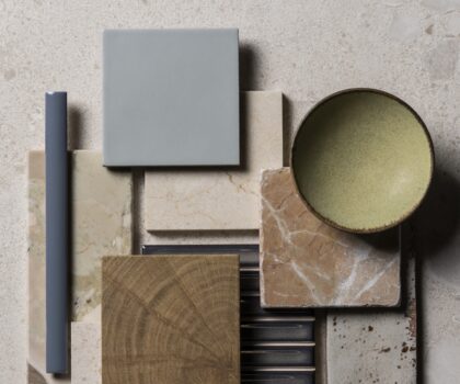
Wishlist Empty
02/03/2023

Interior colours for 2023

If you’re wondering what this year’s go-to shades will be for tiles, paint and more, read on. We’ve compiled our three top palette picks for 2023, which encompass everything from soothing neutral tones to bright and bold coloured tiles.

Warm Neutrals

Comforting and peaceful, warm neutrals will work well in any space, whatever the size. Whether you’re hoping to add value to your house or investing in a forever home, you can be sure that neutral tiles will never go out of style. And, if you’re worried about playing it a little too safe, then rest assured that there are countless ways to add visual interest to a pared-back palette.

1. TRY A TWO-TONE COMBINATION

We love how the pale and subtly varied shades of our matt white Pastella tiles complement the more uniform biscuit beige of the Stamford sand porcelain in this half-and-half wall tile scheme. Pairing a smaller format tile with an impressively large design also enhances a sense of contrast.

2. OPT FOR A STATEMENT MARBLE

There are few effects more striking than the natural veining of our Violetta honed marble tiles, which feature swirling patterns in deep brown, purple and green. For an affordable, low-maintenance and incredibly realistic alternative, look to our Violetta Nouveau porcelain tiles.

3. PLAY WITH CONTRASTS

A neutral tile scheme doesn’t mean your entire bathroom has to adhere to a pale or subtle aesthetic. Try pairing an ivory tile, such as our Paloma porcelain design, with furniture, hardware or accessories in stronger shades for depth and contrast. Here, these neutral tiles provide the perfect backdrop for the dark wooden vanity unit and burnished bronze tapware.


Grounding Greens

A huge hit in 2022, green tiles look set to remain a popular choice for the coming year. However, this timeless shade never really dates if incorporated in the right way, as is true of most colours drawn from nature’s palette. From bright and energising to calm and mellow, green has the power to transform both your space and your mood.

1. CHOOSE A CLASSIC ZELLIGE DESIGN

Inspired by handmade Moroccan tiles, our glossy Zellige 2022 tiles come in a beautiful sage colourway, which combines chalky shades of green with warmer hits of amber. Their undulating glazed surface helps to offset the use of colour, ensuring that your space won’t feel overpowered, whether you tile a single wall or go for a wraparound scheme.

2. ELEVATE WITH HERRINBONE MOSAICS

If you’re looking to update a kitchen splashback, or to create a feature wall within an otherwise understated interior, then these Verde Marl marble mosaics could be just the tile for the job. Their zigzag herringbone design adds a graphic touch, and works well in modern and more traditional spaces. Tonal variation helps to dial down the strength of the jewel-green shades, as does the marble’s natural veining.

3. KEEP IT CURRENT WITH RECTANGULAR TILES

If you love a subway or brick tile, then try a different take on a look with slim rectangular tiles laid in a vertical grid. Stacked rather than staggered, these sleek and slender tiles feel instantly fresh and modern. Here, we’ve used our Pastella porcelain tiles in a soft sage shade that’s ideal for bathrooms, showers and kitchens of all styles and sizes.


Rust and Terracotta

Tiles in shades of soft red, burnt orange and rich brown make up one of our top trends for the coming year. Choose lustrous glazes to lift these colours or matt finishes if you prefer an earthier, more organic feel. For a more accessible approach to working with strong colours such as these, try a stone like our Rosso marble, which combines muted red tones with pale mineral veining and a tumbled edge.

1. CHOOSE RICH RED MARBLE TILES

We love seeing our Fitz marble tiles applied in a rectangular format: a perfect marriage of modern and classic. Veining in cream and rust tones helps to break up the deep reds and burgundy shades that make this tile so striking, while the grid-like layout adds a distinctly contemporary edge.

2. PLAY WITH TONAL TOBACCO SHADES

If red feels a little too outside your comfort zone, then consider shades of ochre or burnt orange as an alternative. These Hoxton tiles in ochre feature a lustrous glaze, which offsets the strong colour choice, as does the tonal variation between the tiles.

3. TRY AN EARTHY TAKE ON CHECKERBOARD

If you love the idea of a checkerboard floor but would prefer a softer colour scheme than black and white, then our Rosso di Scacchi tumbled marble tiles might be the answer. Pair the warm, clay tones of these sandy-red tiles with pale Calacatta marble for a timeless take on this elegant trend.

Share this

Wilmslow Weybridge Tunbridge Wells Primrose Hill Petersfield Monmouth Outlet Warehouse Monmouth Head Office Monmouth Marlow Harrogate Fulham Road Exeter Cheltenham Cardiff Cambridge Bristol Bath