2. Matching or contrasting: the grout colour question
This is where most of the creative decision-making happens, and there’s no single right answer. But there are a few reliable principles.
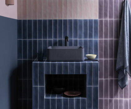
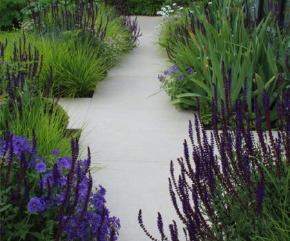
A close match between grout and tile creates the most seamless result. It’s particularly effective with large-format tiles, marble, and stone, where you want the surface to read as one uninterrupted plane. Ardex Flex FS in Brilliant White alongside white or light grey porcelain is a good example. The joint is there for function; it reads as texture, not colour.
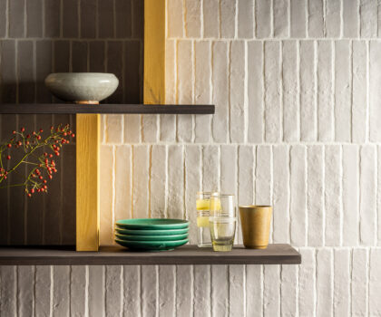
Contrasting grout makes the tile format part of the design. Dark grout on a white brick-format tile brings the grid into focus. It’s graphic, deliberate, and works well when the laying pattern is the point. FL’s 35-colour range gives plenty of room to play here, from soft naturals like Stone Beach and Natural Almond through to Cast Iron and Black.
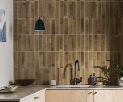
Mid-tones are often underused but worth considering, especially with terracotta, limestone, and warmer neutrals. A grout like Dove Grey or Floating Driftwood can sit between tile and background without disappearing entirely, giving the surface some definition without the sharpness of a full contrast.