05/02/2026

Mix it. Match it.

SOFT COLOUR, GENTLE CONTRAST, AND LAYERED MATERIALS THAT FEEL EASY AND CONSIDERED.

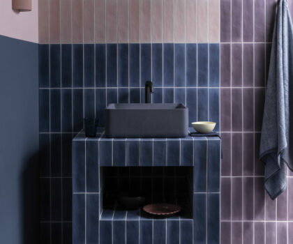
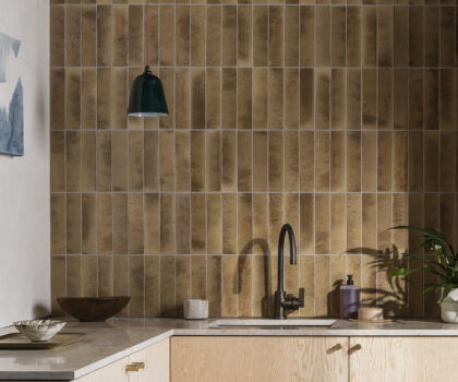
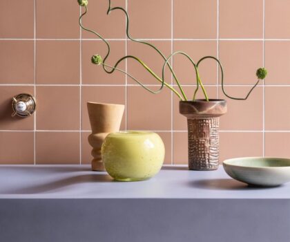
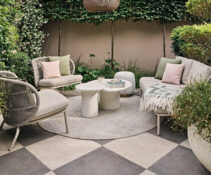
This edit is all about light combinations and relaxed pairings. Soft tones sit side by side, finishes feel tactile rather than bold, and nothing tries too hard. It’s a look that feels calm, but still full of interest.

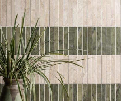
Warm and ivory-toned, Jude Gloss Ceramic works as a quiet backdrop on walls. The subtle sheen catches the light just enough, making spaces feel brighter without drawing attention away from the rest of the room. Simple layouts keep it feeling timeless.

To bring in colour without overwhelming the space, Pastella Porcelain does the job beautifully. Muted pastels add softness and warmth, especially when used in smaller areas or as a contrast to neutrals. The matt finish keeps everything grounded and easy to live with.

For something with more depth, Ceppo Sicilia Honed Marble adds natural variation. Its mix of fragments and gentle colour shifts brings texture and movement, working well alongside softer ceramics. Used on floors or surfaces, it anchors the scheme without making it feel heavy.

Finishing touches matter too. Mizu Grey Gloss Ceramic keeps things light and understated, with a soft grey tone that sits comfortably among pastels and stone. For a little more detail, Mizu White Decor Gloss Ceramic adds subtle pattern through gentle geometric relief. Used on its own or paired with the plain tile, it brings depth without overwhelming the space. Kept simple, both help everything else fall into place.

This edit is about balance. Mixing finishes, tones, and materials in a way that feels natural. Nothing forced. Just calm layers that work well together.

Share this

Stay in the know,
sign up for exclusive inspiration & offers

Join our newsletter for exciting insights, exclusive offers, design inspiration, and more.