Who would have thought I’d be writing a blog post on ‘beige’? Now those that know me (and my home) know I’ve long been a fan of simplistic, Scandinavian style interiors that ooze cool tones of grey and white. However lately I’ve been totally drawn in by these warmer hues. My Pinterest boards are full of them. ‘Beige’ as a word is off-putting admittedly, usually associated with being boring and drab. However, this word does perfectly encompass a most desirable spectrum of off-whites, sandy hues, camel tones, taupes, nudes, milky creams, biscuit shades and oatmeal. These ‘new neutrals’ are just so easy on the eye, elegant too, and definitely more cosy than the cooler greys. Now I’m not saying the ever popular ‘grey’ has had its day just yet, but these warmer tones are certainly giving it a run for its money.
Beige needn’t live up to it’s name either. We’re not talking old school beige; bland interiors with yellow toned-magnolia paint and dreary fabrics. We are talking of new nature inspired neutrals with clean interior lines and pops of colour. Combine with vintage pieces, sharp accents of black and plenty of texture including wood, concrete, linen and pattern.
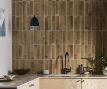
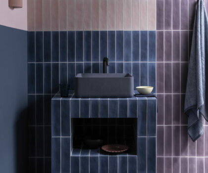
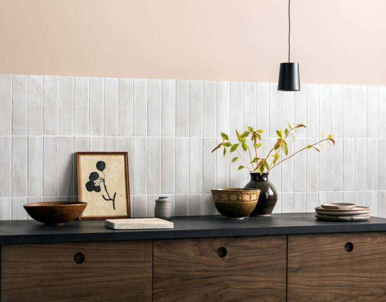
Tiles are the perfect way to introduce these tones, from subtle and stylish wall tiles to flooring that will provide the perfect neutral back drop. Here are our favourites.